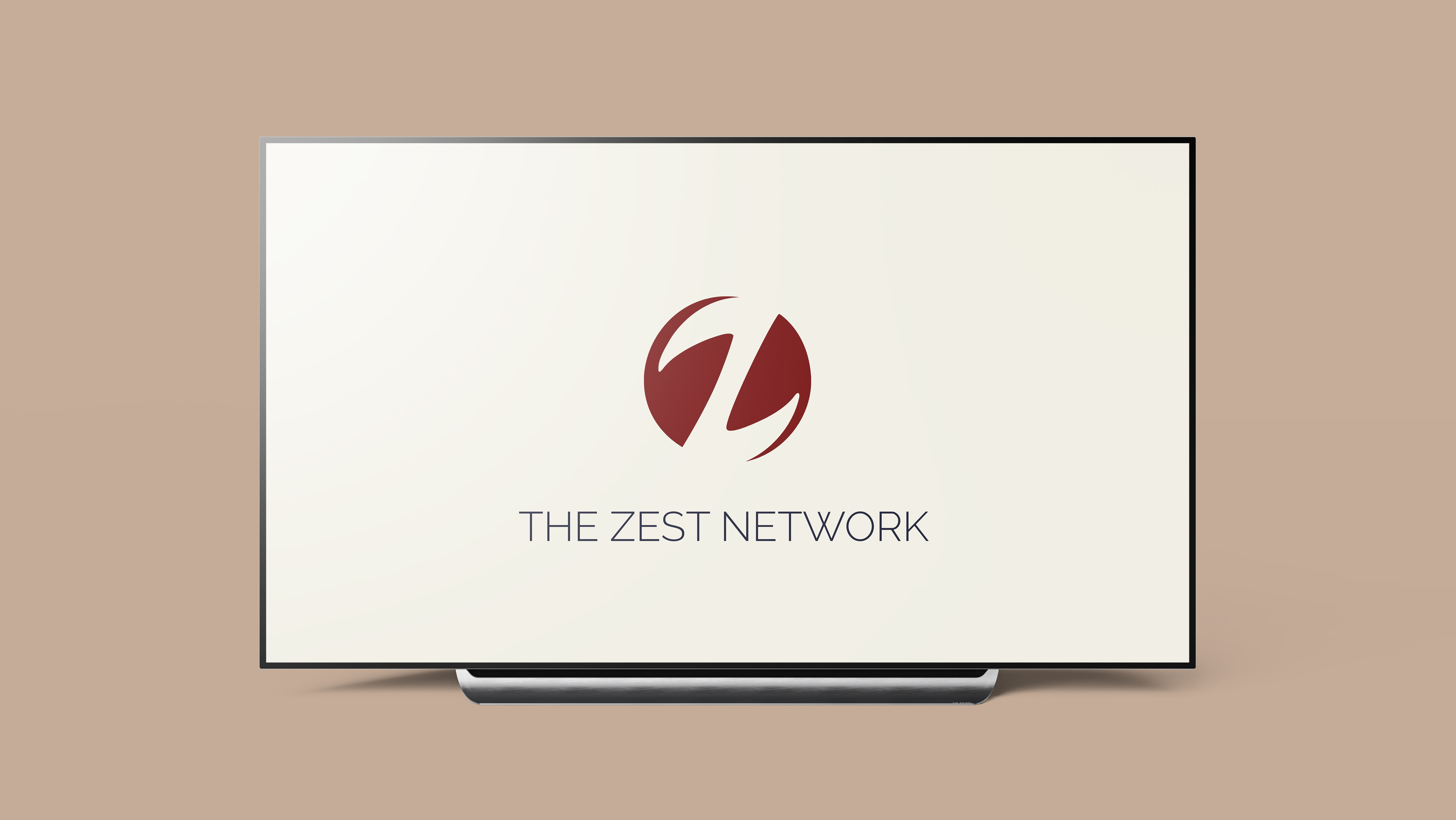

This rebrand called for not only a new name but an entirely new approach. We needed something that felt exclusive, yet inviting, sophisticated, yet approachable. This led me to take inspiration from a number of sources, including private membership clubs, high-end real estate, and other magazine's membership programs.

With all of this in mind, I landed on this concentric circle mark, which somewhat resembles a Celtic knot and has the same intended symbolism of interconnectedness. This minimal mark left room for a wide range of accent colors to be used when needed.
Logo animation by Inc's in-house video team.